Entre Calles
Community Communication Platform
Branding and spatial design for a multi-brand trade show generating high-volume commercial impact.
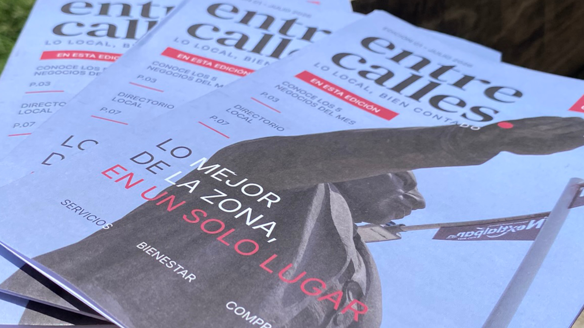
5,000 printed copies
14 participating businesses in the first edition
Distribution across Nextlalpan and surrounding communities
50+ businesses contacted during the launch
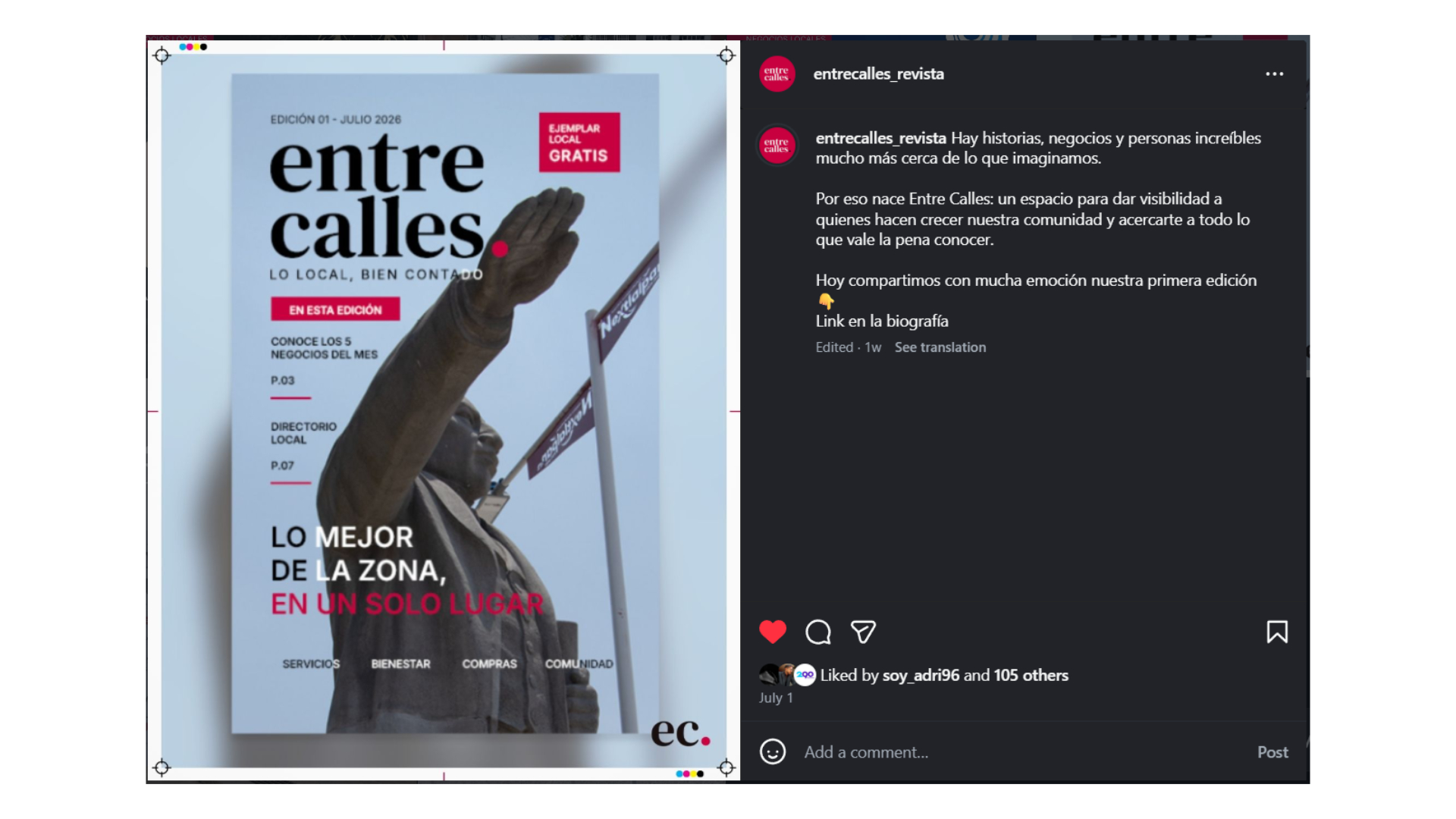
4,300+ social media views supporting the publication’s release
Why This Project Exists
Shortly after moving to a new neighborhood, I realized how difficult it was to discover local businesses. Searching online revealed only a fraction of what was actually there, while simply walking through the streets uncovered dozens of shops, restaurants, and services that had little or no digital presence.
That experience raised a simple question:
How could local businesses become easier to discover while creating something valuable for the community?
Entre Calles was born from that question.
Understanding the Opportunity
Before defining the solution, I spoke with local business owners to understand how they promoted their businesses, the challenges they faced reaching new customers, and whether there was interest in a community-focused publication. Those conversations helped validate the need for a platform that combined local storytelling with accessible advertising.
Challenge
Design a publication that people would genuinely want to read and that local businesses would trust as a valuable advertising platform. Because it was launching from scratch, every touchpoint, from the identity and editorial system to the media kit and promotional materials needed to establish credibility while remaining accessible to a diverse local audience.
My Role
I led the visual development and launch of the publication, including:
- Brand Identity
- Editorial Design
- Editorial System
- Print Production
- Media Kit
- Sales Presentations
- Advertising Materials
- Social Media Content Design
Social media strategy and account management were led by my business partner, while I focused on the publication’s visual communication and creative execution.
Approach
Brand Identity
A familiar voice for a new local medium
Entre Calles needed an identity that felt familiar yet innovative. I aimed for a visual language that was traditional but not outdated, simple, functional, and memorable, rather than decorative or corporate.
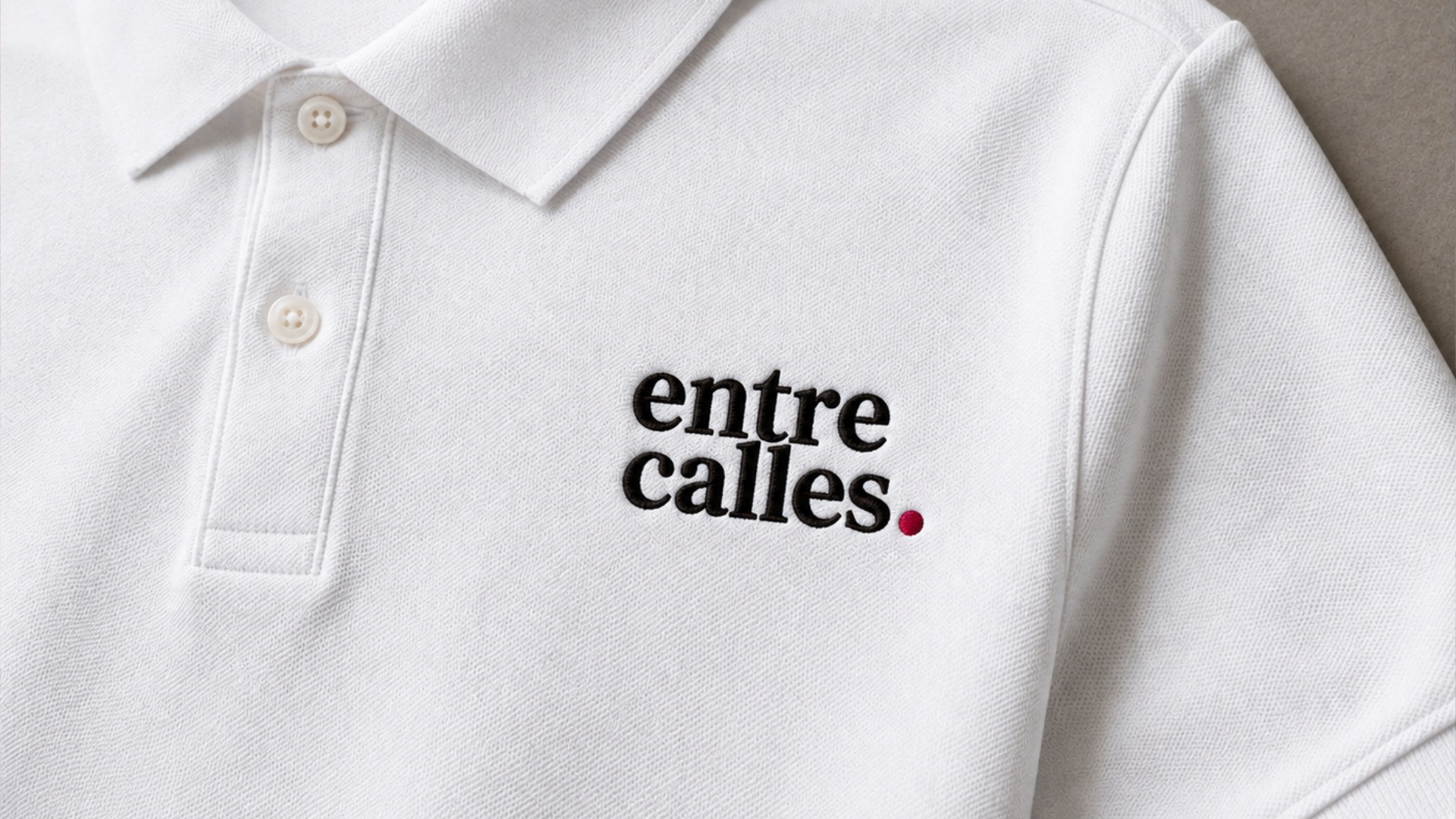
The name became the primary identifier, with DM Serif Text chosen for its classic serif style, conveying familiarity and trust. Inter was selected for supporting text, contrasting the publication’s traditional editorial style with its modern digital presence.
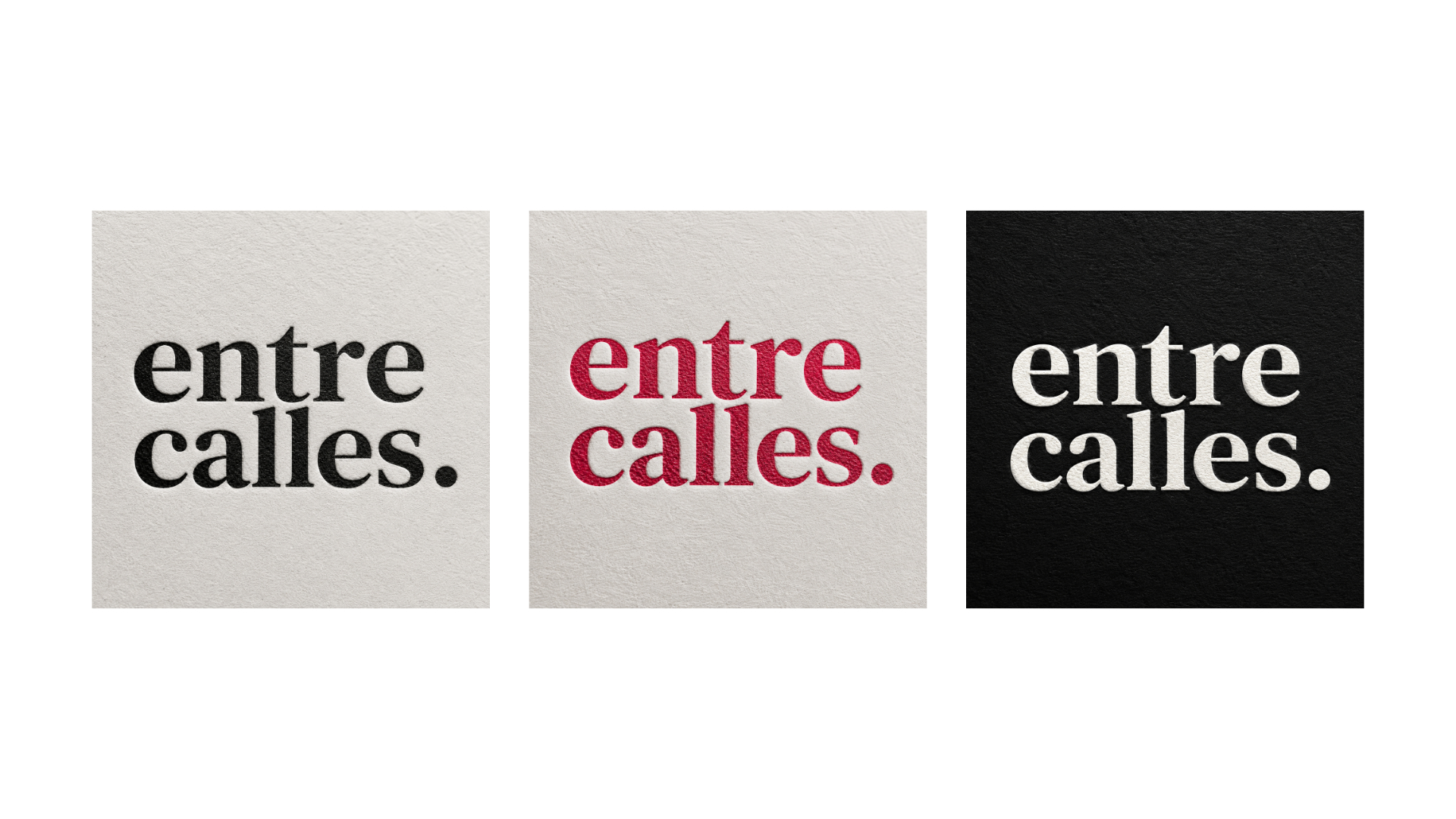
The color palette maintained simplicity and familiarity, featuring a red-caramel tone inspired by local cherry-colored elements, complemented by black and off-white to enhance the printed publication’s character.
Instead of a complex symbol, I focused on a recognizable visual language for the magazine, advertisements, and digital platforms, establishing a trusted local medium for discovering businesses, services, and stories.
The identity is a way of expressing how the community feels, discovers, talks, exists, and needs.
Editorial System
With the identity established, the next challenge was creating an editorial system that could organize different types of local content while keeping the publication approachable and easy to navigate.
A flexible grid allowed the publication to accommodate different article lengths, imagery, advertisements, and business listings while maintaining consistent margins, alignment, and rhythm throughout the issue.
Editorial content
→ articles / stories
Local discovery
→ recommendations / events
Commercial content
→ advertisements / sponsored spaces
Local discovery
→ business listings
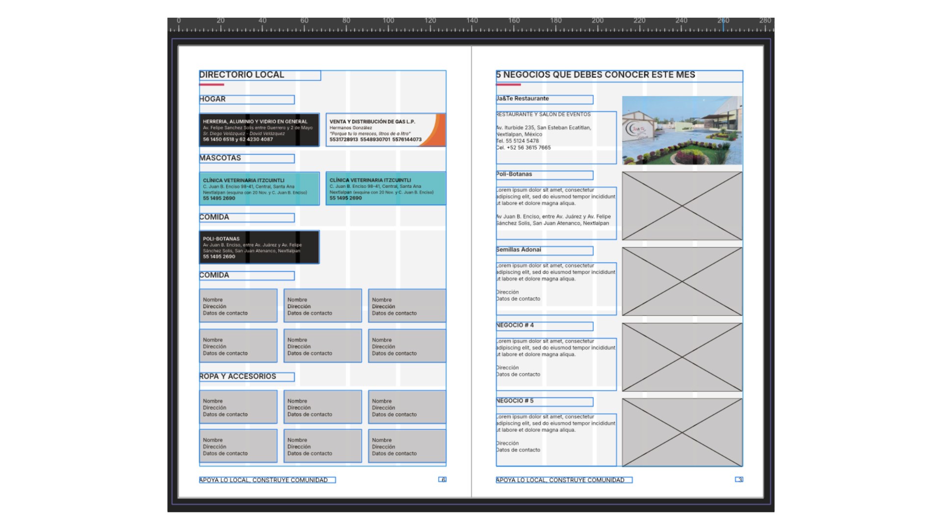
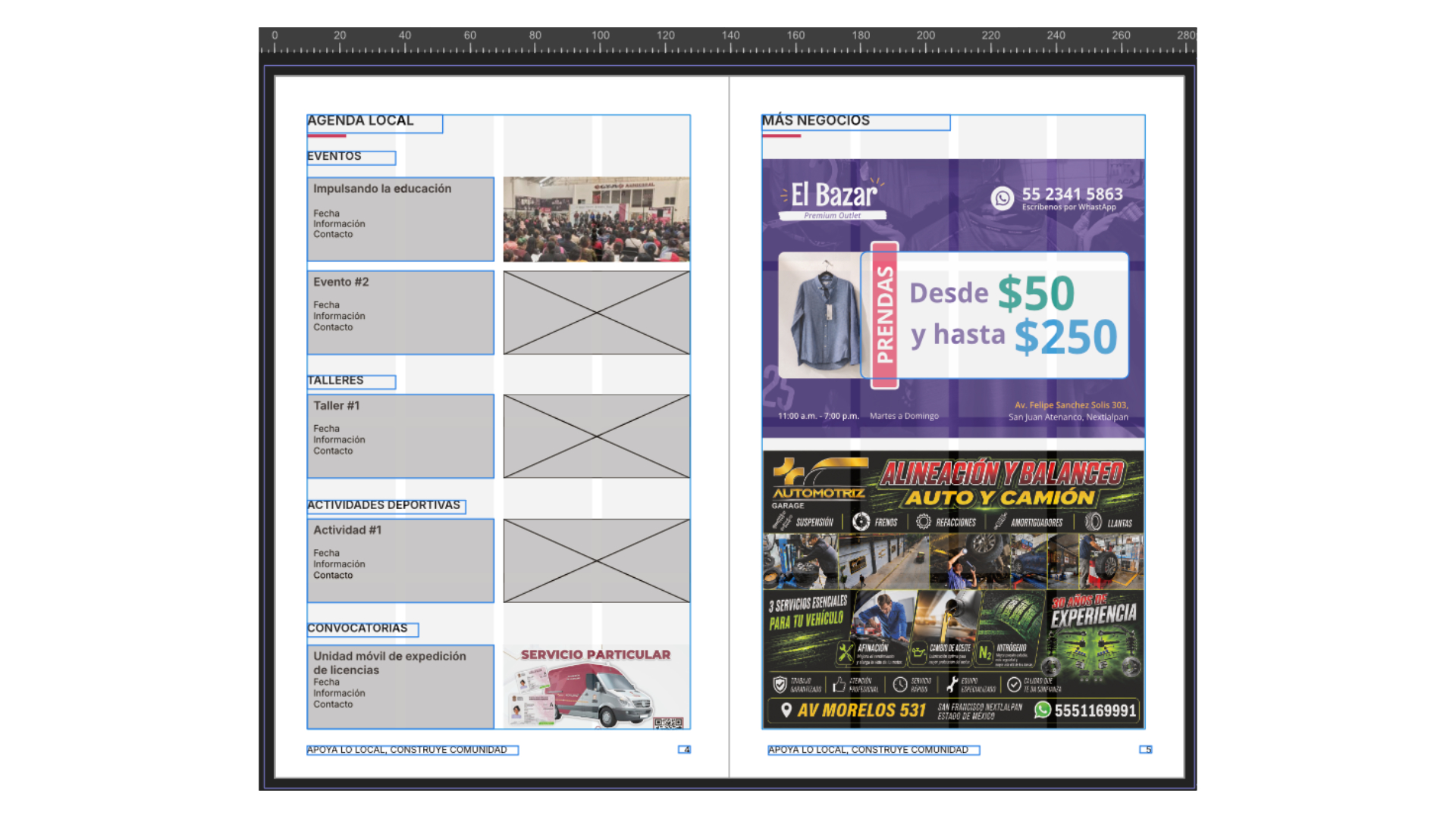
Designing around real constraints
Because the publication combined editorial content with paid advertising, the layout needed to give commercial spaces clear boundaries without making the magazine feel like a collection of ads. The system was designed to keep advertisements visually integrated while preserving a clear editorial rhythm.
Commercial Communication
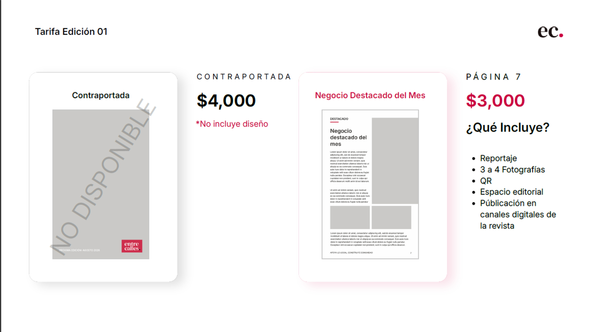
As a new publication, Entre Calles also needed to communicate its value to local businesses before it had an established audience or track record. I developed the commercial materials needed to introduce the publication, explain its advertising opportunities, and make the value of participating easy to understand.
The media kit brought together the publication’s identity, distribution, advertising formats, and pricing into a single visual system. Supporting materials were designed to make different participation options clear while maintaining the same approachable visual language as the publication itself.
Making the offer understandable
The challenge was to make the advertising offer understandable without overwhelming business owners with information. I organized the available formats, pricing, distribution, and benefits into a straightforward visual hierarchy so that businesses could quickly understand where they fit within the publication.
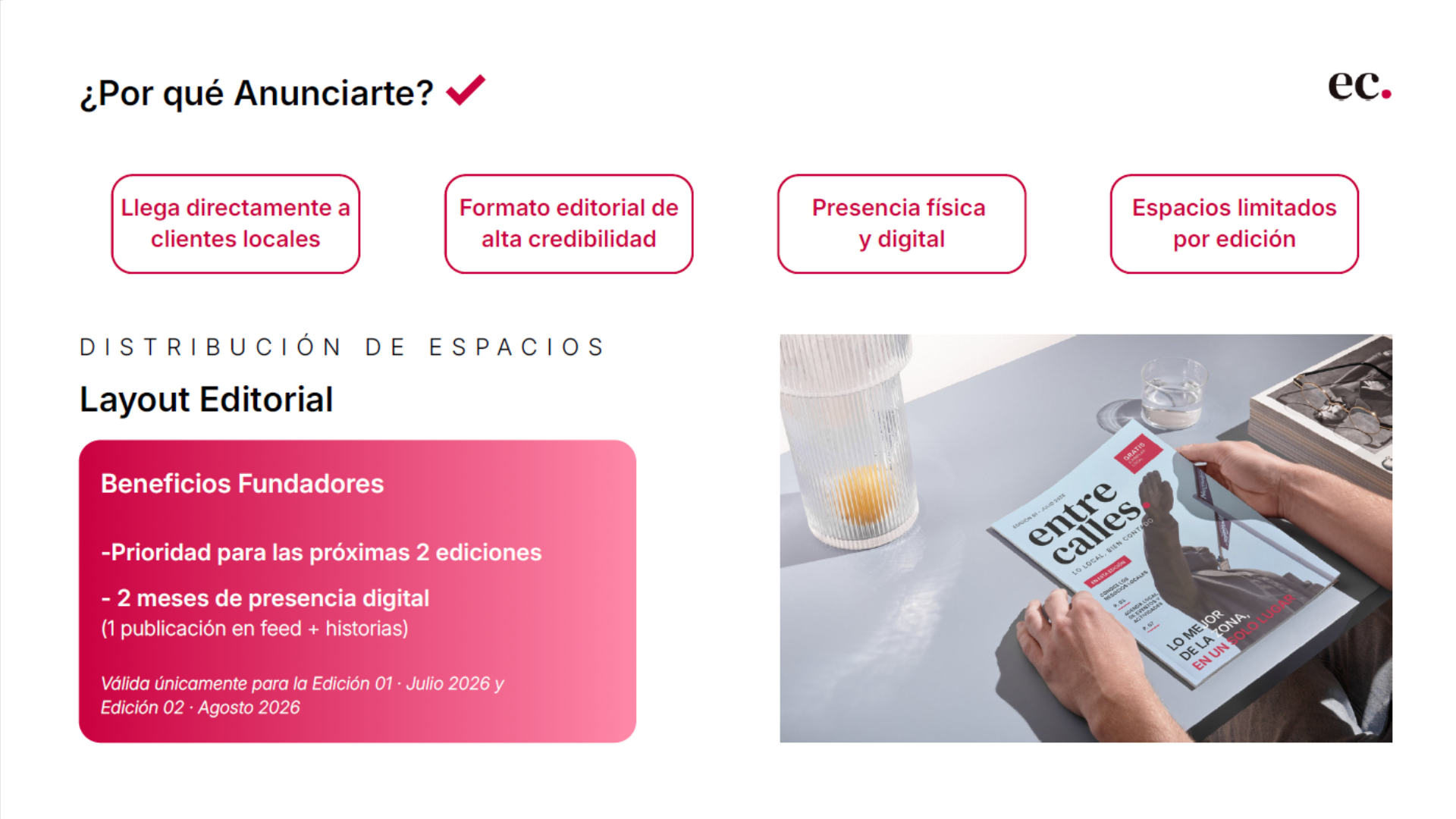
The balance between editorial and commercial identity
Because the publication was built around local discovery, the commercial communication needed to feel like a natural extension of the publication rather than a separate sales product. I kept the same visual language across the media kit, advertising materials, and publication while allowing each business’s own identity to remain visible.
My Role in the Sales Process

14 businesses participated in the first edition
Launch Assets
Reflections
This project reinforced something I continue to carry into every new challenge: meaningful design begins long before visual exploration. Taking time to understand people’s experiences, listening to stakeholders, and validating assumptions shaped a stronger solution than the magazine alone. It became a reminder that good design can connect businesses, communities, and ideas when it starts with the right questions.